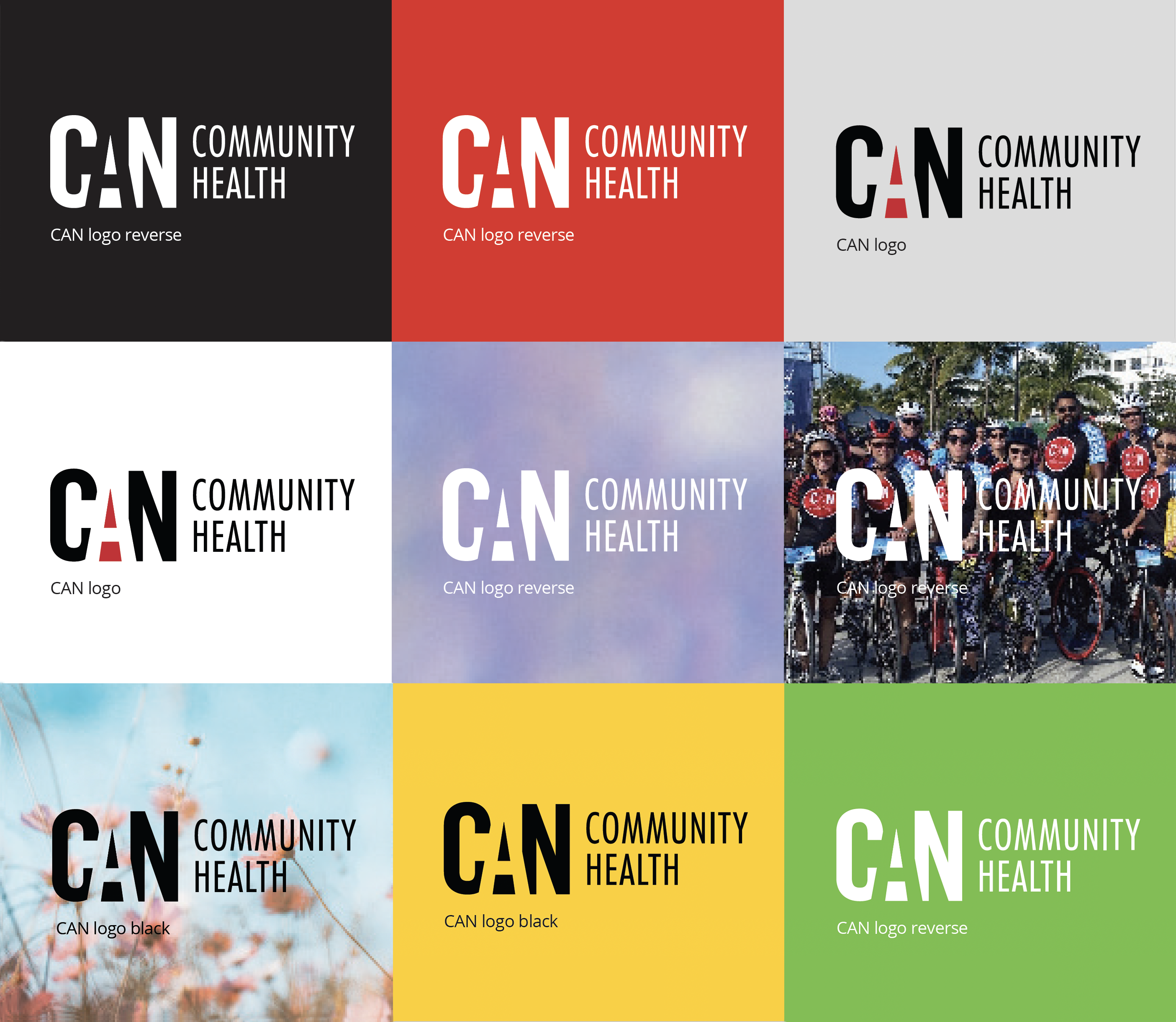
The CAN logo (horizontal) is always the first choice for our logo. Use the centered version only when the space you have available is more favorable to it's square format. Consider which version of the logo will make "Community Health" more legible.
There is a selection of file types beside or below each logo. Select the link for file type you require then look for the download icon on the resulting page. It is in the upper right area of the window.
The "black" and "reverse" (white) versions of our logos are often the most favorable option when printing on a complicated background that could challenge the legibility of the logo. Consider which version of the logo will make "Community Health" the most legible.